SwissSuperLeague dataviz remix 1 - Points evolution
football · sports · Switzerland dataviz · ggplot2 · R · remix · swissSuperLeague
This post is part of a dataviz remix series of the Swiss football league’s results. The motivations behind it are explained in this post.
Première mouture
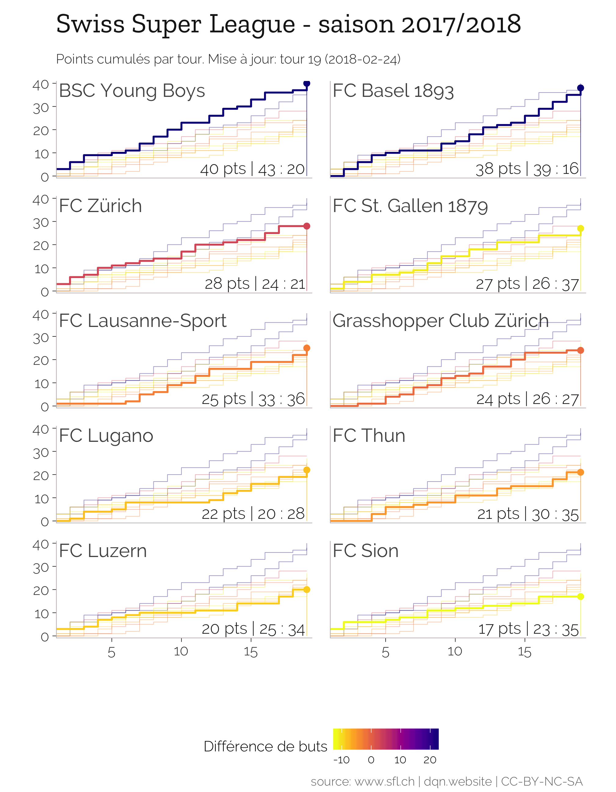
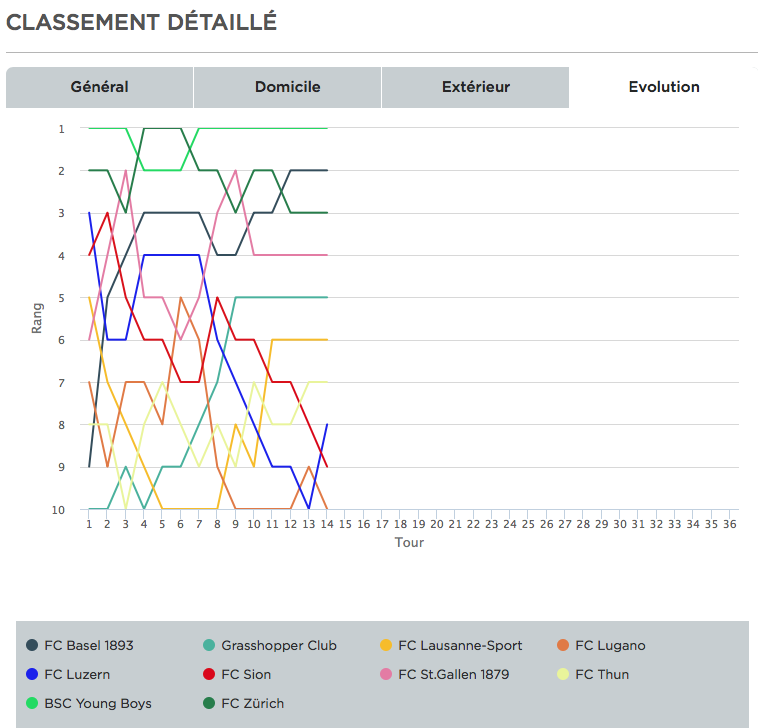
Mon but ici, visualiser l’évolution des résultats des équipes. En comparaison avec le graphique officiel de la Swiss Football League ci-desssous, je suis plutôt satisfait.
J’apprécie de pouvoir constaster les passages à vide ou la constance de certaines équipes. Par exemple, le début de saison calamiteux du Lausanne Sport, suivi d’une jolie remontée.
Dataviz details
It is a small multiple chart of the cumulative points by round.
- The stats in each facet is the: cumulative points | goals scored : goals conceded
- The colour used for each team is encoded by the goal differential at the last round
- All teams are showed with some transparency. To plot the background data in all facets, I used this trick.
R code
## Data wrangle
f_pts <- ts %>%
  filter(nmatch == max(nmatch)) %>%
  select(team, cum_pts, cum_balance) %>%
  rename(f_pts = cum_pts, f_balance = cum_balance)

tsf <- left_join(ts, f_pts)

# trick to display background data in all facets # https://drsimonj.svbtle.com/plotting-background-data-for-groups-with-ggplot2
ts.bg <- tsf %>%
  mutate(team.ori = team) %>%
  select(nmatch, cum_pts, team.ori, f_pts, f_balance)
ts.last <- tsf %>%
  filter(nmatch == max(nmatch)) %>%
  mutate(
    xlab1 = 1.2,
    ylab1 = max(cum_pts) -0.1,
    xlab2 = nmatch -0.1,
    ylab2 = 1,
    stats = paste0(cum_pts, " pts | ", cum_scored, " : ", cum_against),
    ystart = 0
  )

nround <- max(tsf$nmatch)
aratio <- (nround / max(tsf$cum_pts)) / 1.25

## PLOT
gp <- ggplot(data = tsf) +
  geom_step(data = ts.bg,
            aes(x = nmatch, y = cum_pts, group = team.ori, colour = f_balance),
            size = 0.25, alpha = 0.4) +
  geom_step(aes(x = nmatch, y = cum_pts, group = team, colour = f_balance),
            size = 0.75, direction = "hv") +
   dqn_theme() +
  facet_wrap(~team, ncol = 2, strip.position = "top") +
  theme(
    legend.position = "bottom",
    #plot.background = element_rect(fill = '#EFF2F4'),
    axis.ticks = element_line(size = 0.2),
    plot.margin = unit(c(0.4, 0.4, 0.1, -0.4), "cm"),
    strip.text = element_blank(),
    panel.grid.major = element_blank(),
    panel.grid.minor = element_blank()
  ) +
  scale_x_continuous(
    name = "", minor_breaks = NULL,
    breaks = scales::pretty_breaks(n = 5), expand = c(0,0),
    limits = c(1, nround + 0.4)) +
  scale_y_continuous(
    name = "",
    breaks = scales::pretty_breaks(n = 3), expand = c(0,1)) +
  scale_color_viridis(option = "C", direction = -1, name = "Différence de buts") +
  labs(caption = "source: www.sfl.ch | dqn.website | CC-BY-NC-SA ",
       title = "Swiss Super League - saison 2017/2018",
       subtitle = paste0(
         "Points cumulés par tour. Mise à jour: tour " ,
         nround, " (", Sys.Date(), ")")
       ) +
  annotate("segment", x=-Inf, xend=Inf, y=-Inf, yend=-Inf, color = "#C2BABA") +
  annotate("segment", x=-Inf, xend=-Inf, y=-Inf, yend=Inf, color = "#C2BABA") +
  theme(aspect.ratio = aratio)

# add faceted text
gp2 <- gp +
  geom_text(
    data = ts.last, aes(x = xlab1, y = ylab1, label = team),
    hjust = 0, vjust = 1,
    size = 5.4,
    alpha = 0.75,
    family =  "Raleway") +
  geom_text(
      data = ts.last, aes(x = xlab2, y = ylab2, label = stats),
      hjust = 1, vjust = 0,
      colour = "black",
      alpha = 0.9,
      size = 4.7,
      family =  "Raleway Light")
# add lollipop for the last game
  gp2 +
    geom_point(data = ts.last, size = 2,
                   aes(x = nmatch, y = cum_pts, colour = f_balance)) +
    geom_segment(data = ts.last,
                 aes(x = nmatch, xend = nmatch, y = ystart, yend = cum_pts,
                     colour = f_balance),
                 alpha = 0.7, size = 0.25)
Trials
ggplot(data = ts) +
  geom_step(aes(x = nmatch, y = cum_pts, group = team, colour = team), size = 1, alpha = 0.7) + dqn_theme()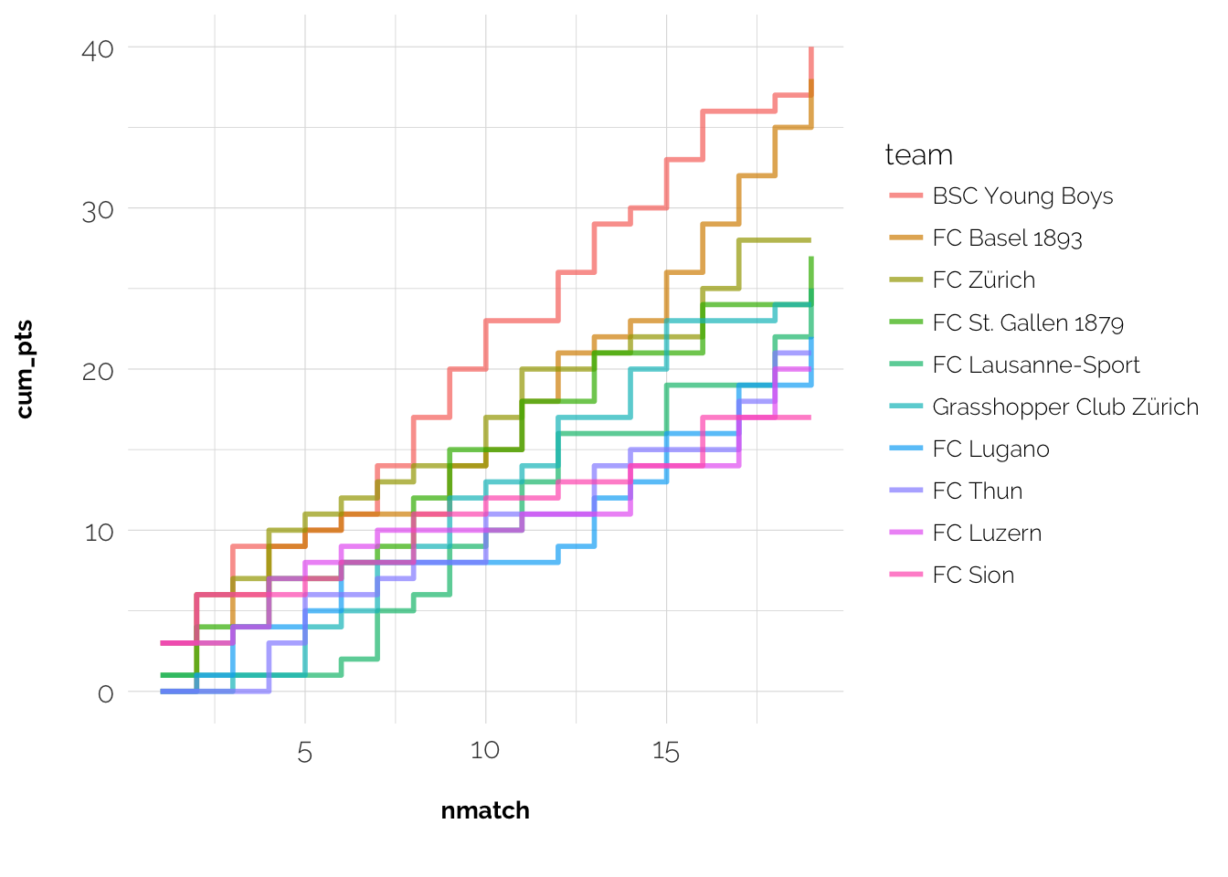
Figure 1: Step chart withtout faceting and background data
ggplot(data = ts) +
  geom_line(aes(x = nmatch, y = rank, group = team, colour = team), size = 1, alpha = 0.8) +
  dqn_theme()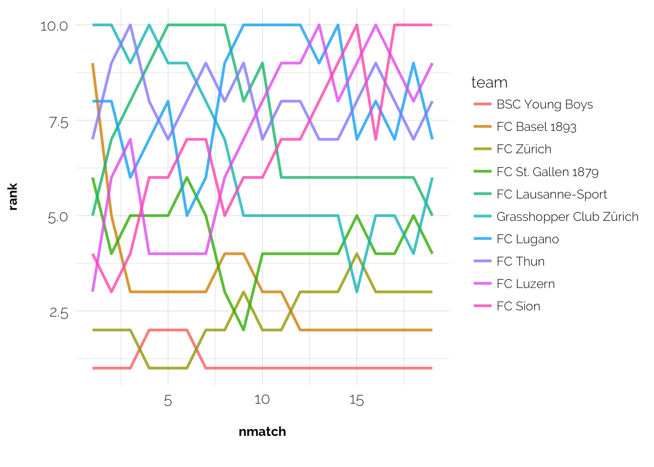
Figure 2: Plotting rank over time should make sense right?
ggplot(data = ts) +
  geom_step(aes(x = nmatch, y = cum_pts, group = team, colour = rank),
            size = 1, alpha = 0.7) +
  dqn_theme() + facet_wrap(~team, ncol = 2) +
  scale_x_continuous(
    name = "Tours", minor_breaks = NULL,
    breaks = scales::pretty_breaks(n = 1), expand = c(0,0)) +
  scale_color_viridis()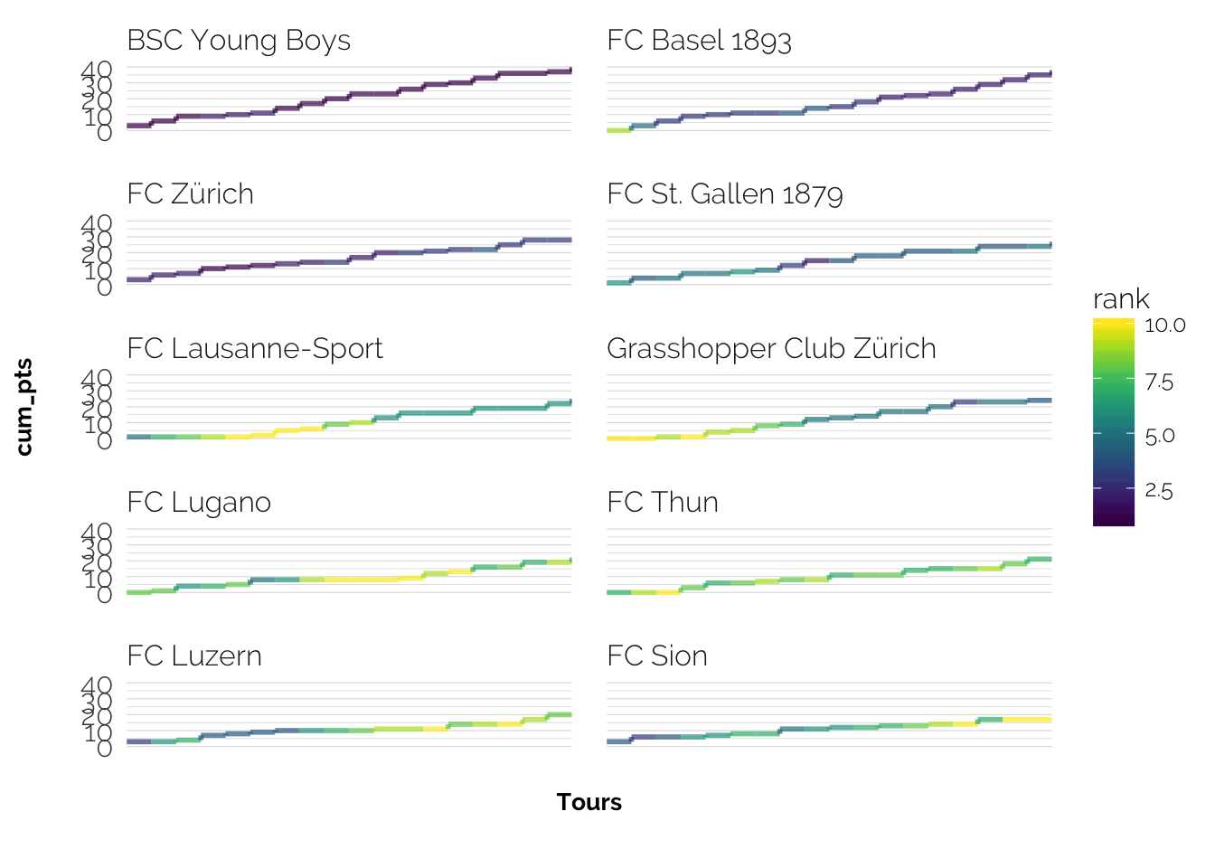
Figure 3: Colour is encoded by the (continous) rank, unsure whether this is a useful feature