Time for sports to get a dataviz makeover
dataviz · media · sports dataviz · football · remix · swissSuperLeague
I have to confess, I am not into sports. Nor do I know much about football. But as media and data professional, I am irked by how sport is summarised and visually conveyed.
I am referring here to the ubiquitous league table. Present everywhere, whether being in print or online. All team sports’ results are recapped in such table.
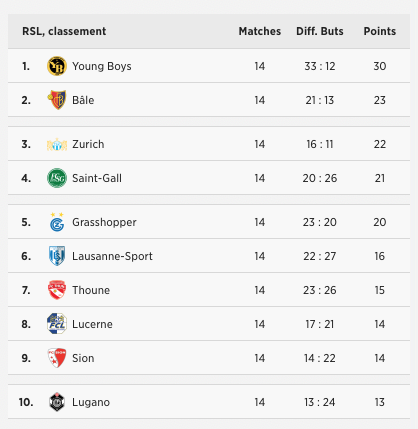
RTS Sports’s football table for the Swiss Super League
What’s wrong with league table?
I am aware I am having a rather a diehard stance here. Of course league tables are useful to show where team currently stand and to cram stats such as points, wins, loss, goals,…
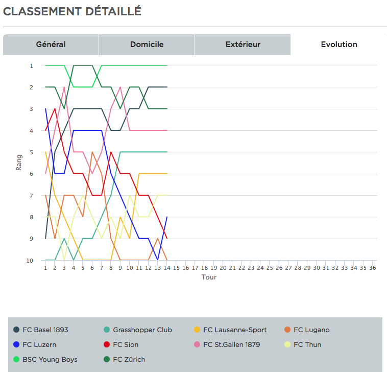
My issue with it is for people like me who do not regularly follow sports. One cannot get from such table how teams performed over time, like has a team been any good/bad lately?
IMHO, league table is a legacy of old day media/journalism where data/news were scarce. And like with the current general media crisis, there is an unmet demand to synthesise sports information. Furthermore, sports generate more and more data. There are hence plenty of ways to summarise its information to be both insightful and visually attractive.
But most importantly, league table fails to achieve its purpose. According to Wikipedia’s definition:
A league table is a chart or list which compares sports teams ….. by ranking them in order of ability or achievement
League table does the job listing achievements, but does not fulfil its primary purpose to rank teams by ability. Summing up different metrics (such as goals, wins, losses) as it is done routinely, is both primitive and fallacious.
I am not a statistician nor a mathematician, but there have been for decades much more insightful metrics in sports (and in football in particular) that are informative to anybody. For instance, metrics such as the expected number of goals scored or conceded per game by a team would be understandable and useful to anybody (much more so than summing up the number of goals).
Content produced by media needs of course to be understandable and to appeal to the largest audience possible, but it should also be able to give to convey the most relevant information at hand. So my aim here is to post more insightful football metrics instead of a race to the bottom.
There are of course plenty of people and media that came to that same conclusion before. 538 and the Financial Times, to mention only two, have done outstanding work visualising, modelling and conveying football analysis. As often, English-speaking media are the forefront.
It is easy to only criticze, so as a challenge I will regulary post quick data visualisation “remix” of the Raiffeisen Swiss Super League results.. I hope this will be interesting and not appeal only to stathead or dataviz amateurs. In a second step, I hope to look into alternative (and better) metrics to rank and classify teams’ ability.
If you are interested, check the posts tagged as #remix, #football, #swisssuperleague