Interactive mekko charts in R
dataviz · R · Switzerland · job · foreigners R · dataviz · interactive
Mekko what?
Despite its confusing name, Mekko or Marimekko chart is a simple yet effective data visualisation form.
Here is a rundown in R for the interactive Mekko chart under (which is part of this story). I used ggiraph, a great ggplot2 extension that binds d3.js to ggplot2. This allows to easily turn a ggplot2 object into an interactive graphic.
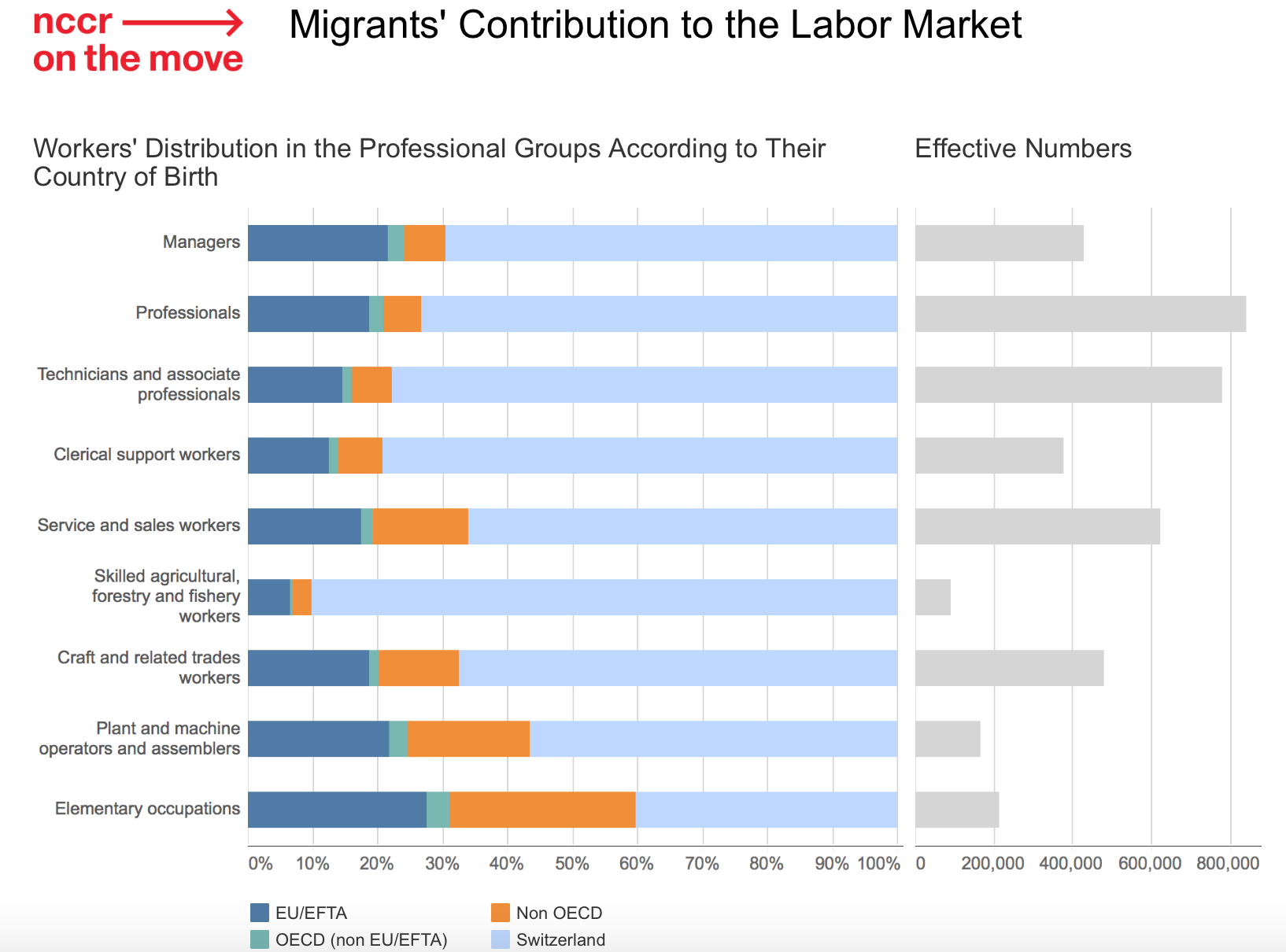
The bar height here is proportional to the number of jobs and shows the large difference of jobs for different occupations.
It can be thought of a regular stacked bar chart with an additional axis. The only alternative to a Mekko chart would be to “facet” as shown under.
FT Chart Doctor provides an excellent explanation of the Mekko chart’s pros & cons. And most importantly, it explains the origins of its enigmatic name (spoiler - a Finnish textile and fashion company’s renowned for its bright repeating patterns).
Mekko chart can boast one on the largest number of synonyms: Mekko, Marimekko, mosaic, matrix or proportional stacked bar chart. I’ll stick here with FT’s designation, proportional stacked bar chart. IMHO, the most meaningful name.
Proportional stacked bar chart chart in R
There are various ways to create such chart in R. There is of course a dedicated R package for it, ggmosaic built on top of ggplot2. And various gists or posts about it.
I use ggiraph a great ggplot2 extension that binds d3.js to ggplot2. This allows to easily render a ggplot2 object as an interactive graphic.
Wrangle the data
Here is the data to plot in a tidy form. They are the job figures in Switzerland, by occupation group (group, an ordered factor) and by country of origin (origin, Swiss or foreigner)
library(magrittr)
library(tidyverse)
library(ggiraph)

jobs <- c("Managers", "Professionals",
          "Technicians and associate professionals",
          "Clerical support workers", "Service and sales workers",
          "Skilled agricultural workers", "Craft and related trades workers",
          "Machine operators and assemblers", "Elementary occupations")
data <- tibble(
  group = factor(rep(jobs, each = 2), levels = jobs),
  origin = rep(c( "foreigner", "swiss"), 9),
  value = c(
    128640.53, 297823.49, 219209.61, 615405.86, 168977.09, 606273.69,
    77485.11, 298635.30, 210439.96, 412074.04, 8740.28, 83336.17,
    151257.24, 323894.43, 68990.99, 93424.47, 126136.14, 86100.60
  )
)
data
Compute for each occupation, the proportion of Swiss/foreigner and the total number of jobs.
data %<>% group_by(group) %>%
  mutate(
    share = value / sum(value),
    tot_group = sum(value)
  ) %>% ungroup()
A proportional stacked bar is composed of rectangles. Rectangles’ coordinates are computed in two steps.
The number of jobs by occupation (y dimension) and the proportion of Swiss/foreigner (x) by occupation. It relies on cumsum() to express all values in a 0 to 1 coordinates.
data %<>%
  group_by(origin) %>%
  arrange(desc(group)) %>%
  mutate(
    ymax = cumsum(tot_group) / sum(tot_group),
    ymin = (ymax - (tot_group/sum(tot_group)))
  ) %>% ungroup() %>%
  group_by(group) %>%
  arrange(desc(origin)) %>%
  mutate(xmax = cumsum(share), xmin = xmax - share) %>%
  ungroup() %>%
  arrange(group)

data %>% select(group, origin, ymin, ymax, xmin, xmax) %>% arrange(desc(group))
## # A tibble: 18 x 6
## group origin ymin ymax
## <fctr> <chr> <dbl> <dbl>
## 1 Elementary occupations swiss 0.00000000 0.05336812
## 2 Elementary occupations foreigner 0.00000000 0.05336812
## 3 Machine operators and assemblers swiss 0.05336812 0.09420840
## 4 Machine operators and assemblers foreigner 0.05336812 0.09420840
## 5 Craft and related trades workers swiss 0.09420840 0.21368795
## 6 Craft and related trades workers foreigner 0.09420840 0.21368795
## 7 Skilled agricultural workers swiss 0.21368795 0.23684109
## 8 Skilled agricultural workers foreigner 0.21368795 0.23684109
## 9 Service and sales workers swiss 0.23684109 0.39337573
## 10 Service and sales workers foreigner 0.23684109 0.39337573
## 11 Clerical support workers swiss 0.39337573 0.48795332
## 12 Clerical support workers foreigner 0.39337573 0.48795332
## 13 Technicians and associate professionals swiss 0.48795332 0.68289448
## 14 Technicians and associate professionals foreigner 0.48795332 0.68289448
## 15 Professionals swiss 0.68289448 0.89276323
## 16 Professionals foreigner 0.68289448 0.89276323
## 17 Managers swiss 0.89276323 1.00000000
## 18 Managers foreigner 0.89276323 1.00000000
## # ... with 2 more variables: xmin <dbl>, xmax <dbl>This is enough to plot a basic proportional stacked bar chart chart
gp <- ggplot(data) +
  geom_rect(aes(ymin = ymin, ymax = ymax, xmin = xmin, xmax = xmax, fill = origin), colour = "white", size = 0.2)
gp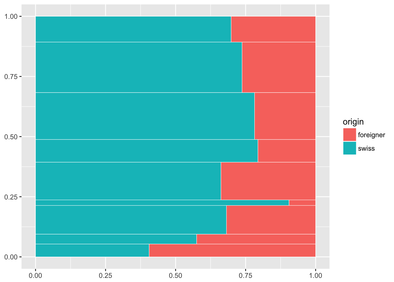
Make it interactive
For an interactive version, two additional optional aesthetic can be provided to ggiraph:
data_idan aesthetic to identify elements on hoveringtooltipthe HTML tooltip text
data %<>%
  mutate(
    data_id = paste0(origin, group),
    tooltip = paste0(
      "<em>", as.character(group), "</em><br>",
      origin, " ", round(share * 100, 1), "%<br>", "(",
      prettyNum(round(value), big.mark = " ", mode = "character"), " jobs)"
    )
  )
# hack to escape single quote
data %<>% mutate(tooltip = gsub("'", "`", tooltip))
Same ggplot2 call as previously, replacing geom_rect() with ggiraph::geom_rect_interactive(), and add the two freshly created aesthetics.
ggiraph() renders a ggplot2 object as an interactive chart in RStudio’s Viewer or for the web browser.
gp <- ggplot(data) +
  geom_rect_interactive(
    aes(ymin = ymin, ymax = ymax, xmin = xmin, xmax = xmax,
        fill = origin, data_id = data_id, tooltip = tooltip),
  colour = "white", size = 0.2)
ggiraph({print(gp)})
Et voilà, a plain looking but functional interactive proportional stacked bar chart
Prettify
Direct labelling
I labelled the jobs directly in the chart’s bars. In this case, because some bars are narrow I scaled the labels according the bars’ height. I added also the % values.
# job labels tibble
labels <- data %>%
  filter(origin == "swiss") %>%
  mutate(y = ymax - 0.01, yRange = (ymax - ymin)* 100) %>%
  select(group, xmin, y, yRange) %>%
  ungroup()

value_labels <- data %>%
  select(group, origin, xmin, xmax, ymax, share) %>%
  mutate(
    x = ifelse(origin == "swiss", xmax, xmin),
    y = ymax - 0.005,
    label = paste0(round(share * 100), "%"),
    hjust = ifelse(origin == "swiss", 1.05, -0.25)
  )


gp2 <- gp +
  geom_text(
    data = labels,
    aes(x = xmin + 0.008, y = y, label = as.character(group), size = yRange),
    hjust = 0, vjust = 1, colour = "white"
  ) +
  geom_text(
    data = value_labels,
    aes(x = x, y = y, label = label, hjust = hjust),
    vjust = 1, size = 2.7, alpha = 0.7, colour = "white"
  ) +
  scale_size_continuous(range = c(2.2, 4.5), guide = F)

ggiraph({print(gp2)})
Theming
gp3 <- gp2 +
  theme_minimal() +
  scale_x_continuous(
    position = "top", expand = c(0.01, 0.01),
    labels = scales::percent, breaks = scales::pretty_breaks(n = 4)) +
  scale_y_continuous(
    expand = c(0,0), limits = c(0, 1.02)
  ) +
  scale_fill_manual(
    values = c('#4c6570', '#b15953')
  ) +
  theme(
    axis.line.x = element_blank(),
    axis.text.y = element_blank(),
    axis.title = element_blank(),
    legend.position = "none"
  )
ggiraph({print(gp3)}, width = 0.9)