Smooth animated temperature shift in R
dataviz · ggplot2 · R
Here is a rundown of the R code I used to create the following animated graphic. This graphic is part of a long form story (paywall, in French) on global warming focused on Switzerland. It shows the shift in monthly temperatures in Geneva for 1864-1900 vs 1982-2018.
It relies on ggplot2 for the chart and on gganimate to, well, you know, animate it. It was my first use of gganimate, a pretty new amazing R package. Its documentation and examples are sometimes lacking, but are growing strong! For this animated graphic, I use only the most basic functionality of that package to tween, i.e. smoothly interpolate, between two states.
First, let’s download and wrangle the data. The data is regularly updated/added comes from MeteoSuisse as a text file.
suppressPackageStartupMessages(library(tidyverse))
library(gganimate)
library(ggalt) # to plot splines

data_url <- "https://www.meteosuisse.admin.ch/product/output/climate-data/homogenous-monthly-data-processing/data/homog_mo_GVE.txt"

# skip all the metadata to read only the data table
table <- read.table(data_url, skip = 27, header = T) %>%
  select(-Precipitation)

months <- structure(1:12,
                    names = c('Jan', 'Feb', 'Mar',  'Apr',  'May',  'Jun',
                              'Jul',    'Aug',  'Sep',  'Oct',  'Nov',  'Dec'))
# express month as factor
table <- table %>% mutate(
  month = factor(names(months)[match(Month, months)],
                 levels = names(months)))

ylim <- table %>% .$Temperature %>% range()
The animated graphic has only 2 states, but it compensates with quite a few geoms/layers. For each state/time period, there are: the monthly temperatures (as splines), the monthly average (dashed line), the columns showing the shift and even a curved arrow to annotate the monthly average. And three text labels are animated, the time period, the monthly average and the shift of monthly temperatures in °C.
I create a data frame/tibble for each layer:
  # Define the two time periods 1864-1900 & 1982-2018s
  periods <- tibble(
    start = c(1864, 1982),
    end = c(1900, 2018),
    color = c("#2a3589", "#c6266d")
  ) %>%
    mutate(name = paste0(start, "-", end))

  # filter data within two periods, will be plotted as splines
  df <- table %>%
    filter((Year >= periods$start[1] & Year <= periods$end[1]) | Year >= periods$start[2]) %>%
    mutate(
      timeP = factor(ifelse(Year <= periods$end[1], periods$name[1], periods$name[2])),
      colour = ifelse(timeP == periods$name[1], periods$color[1], periods$color[2])
  )

  # create a tibble w/ the average monthly temperature for each time period
  mAverageByP <- df %>%
    group_by(timeP, month) %>%
    summarise(average_temp = mean(Temperature)) %>%
    ungroup() %>%
    mutate(colour = ifelse(timeP == periods$name[1], periods$color[1],
                           periods$color[2]))

  # create a tibble of the monthly temperature shift
  shift <- mAverageByP %>%
    group_by(month) %>%
    summarise(y0 = average_temp[1], y1 = average_temp[2]) %>%
    ungroup() %>%
    mutate(timeP = factor(periods$name[2], levels = periods$name))

  # bind the first period, there is no shift, i.e y1 = y0
  shift <- rbind(shift %>%
                  mutate(y1 = y0,
                         timeP = periods$name[1]), shift) %>%
    mutate(timeP = as.factor(timeP))

  # the text label for the monthly temperature shift, if 0 replace by ""
  shiftLabel <- shift %>%
    mutate(
      diff = y1 - y0,
      label = ifelse(
        diff == 0, "", paste0("+", formatC(diff, digits = 2), "°"))
    )
  # text label for the time period
  timePLabel <- tibble(
    x = 7.15, y = 8.4, label = levels(df$timeP),
    timeP = factor(levels(df$timeP))) %>%
    mutate(colour = ifelse(timeP == periods$name[1],
                           periods$color[1], periods$color[2]))

  # text label for the monthly average temperature by time period
  moyenneMLabel <- cbind(
    tibble(
      x = 7.15, y = 4.4,
      label = paste0(levels(df$timeP), " average")),
    mAverageByP %>% filter(month == "Mar")
  )
my_theme <- function(base_size = 22) {
ggplot() +
geom_hline(yintercept = 0, colour = "darkgrey", alpha = 0.6, size = 0.7) +
scale_x_discrete(name = "", position = "top", expand = c(0.02, 0.1)) +
scale_y_continuous(
name = "", expand = c(0.03, 0), limits = ylim,
labels = function(x) paste0(x,'°'),
breaks = scales::pretty_breaks(n = 5)
) +
theme_minimal(base_size = base_size ) +
theme(
plot.title = element_text(hjust = 0, face = "bold"),
plot.subtitle = element_text(hjust = 0),
plot.caption = element_text(colour = "#666666",
margin = margin(0, 22, 24, 0, "pt")),
axis.ticks.length = unit(0.7, "lines"),
axis.ticks.y = element_blank(),
panel.grid.major.x = element_blank(),
panel.grid.minor = element_blank(),
panel.grid.major.y = element_line(
color = "#c2c4d6", linetype = "dotted", size = 0.35),
plot.margin = margin(5, 5, 3, -4, "pt"),
axis.line = element_blank()
)
}Plot the different ggplot2 layers in an object called p here. Printing p will gengerate an error, but you can test it before animating it with a facet_wrap. Yes, the font size might seem gigantic at this point.
fontSize <- 34

p <- my_theme(base_size = fontSize) +
  scale_colour_identity() +
  geom_segment(
    data = shift,
    aes(x = month, xend = month, y = y0, yend = y1),
    size = fontSize / 2.5, colour = "#b30047", alpha = 0.6
  ) +
  geom_xspline(
    data = df,
    aes(x = month, y = Temperature, group = Year, colour = colour),
    size = 0.15, alpha  = 0.9
  ) +
  geom_line(
    data = mAverageByP,
    aes(x = month, y = average_temp, group = 1, colour = colour),
    size = fontSize / 10, linetype = "dashed"
  ) +
  geom_text(
    data = shiftLabel, hjust = 0.5, vjust = 0, nudge_y = 0.45,
    aes(x = month, y = y1, label = label),
    size = fontSize / 3, colour = '#16040c'
  ) +
  geom_text(
    data = timePLabel,
    aes(x = x, y = y, label = label, colour = colour),
    hjust = 0.5, size = fontSize * 0.8, fontface = "bold",
    alpha = 0.8
  ) +
  geom_text(
    data = moyenneMLabel, aes(x = x, y = y, label = label),
    hjust = 0.5, size = fontSize / 3,
    vjust = -1.1, colour = "#666666"
  ) +
  geom_curve(
    data = moyenneMLabel, size = fontSize / 20,
    colour = "#666666", alpha = 0.7,
    aes(x = x, y = y, xend = month, yend = average_temp),
    curvature = -0.8,  arrow = arrow(length = unit(0.01, "npc"))
  ) +
  scale_x_discrete(name = "", position = "top", expand = c(0.04, 0.1)) +
  labs(title = "Geneva already warmed up by 2°C since 1864",
       subtitle = "Monthly temperatures in Geneva 1864-1900 vs 1982-2018",
       caption = "Source: MétéoSuisse | @duc_qn ")
## Scale for 'x' is already present. Adding another scale for 'x', which
## will replace the existing scale.# p + facet_wrap(~timeP)Animate using gganimate::transition_states as stated from the help > This transition splits your data into multiple states based on the levels in a given column, much like ggplot2::facet_wrap() splits up the data in multiple panels. It then tweens between the defined states and pauses at each state.
ap <- p +
  transition_states(
    timeP, transition_length = 10, state_length = 10, wrap = T
  ) +
  enter_fade() +
  exit_fade()

animate(ap, height = 1200, width = 1000)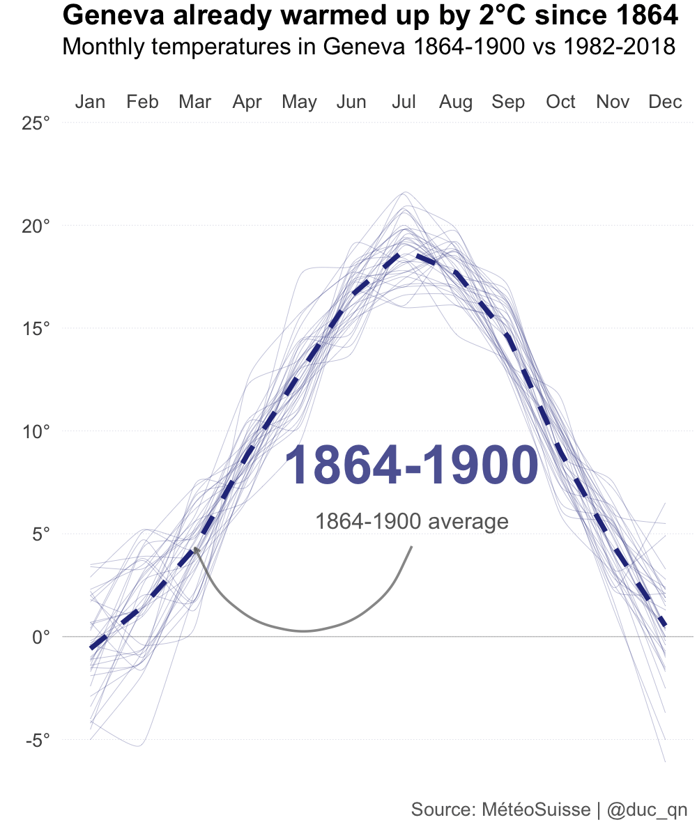
For the animated graphic I used in the long form story, I saved the animation as a mp4 movie rather than a gif to get a much smaller file size. Movie can be looped then using HTML.
  vid_ap <- animate(ap, height = 1500, width = 1200, fps = 100,
                 renderer = ffmpeg_renderer(
                   options = list(pix_fmt = "yuv420p", loop = 0)))
I hope this helps. As mentioned earlier, you can so much more with gganimate. Check its wiki for more examples.
comments powered by Disqus